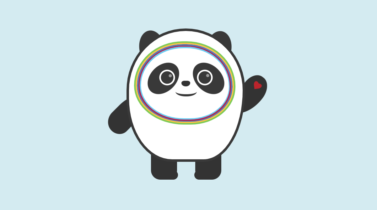
在上一篇《冰墩墩生成程序--Python画冰墩墩》文章中,介绍了使用Python语言来画一个冰墩墩,那么这里我们再来使用CSS在网页上来画一个冰墩墩。
下载链接:https://pan.baidu.com/s/1JvaRYY7zbsLnQdnvp9k5Dg
提取码:sdjy
具体代码如下:
<!DOCTYPE html>
<html><head><meta http-equiv="Content-Type" content="text/html; charset=UTF-8">

<title>CSS版本冰墩墩-2022</title>
<style>
* { margin: 0; padding: 0 }
body { font: 15px "Microsoft YaHei", Arial, Helvetica, sans-serif; background: #e5ffff;   }
.bdd { position: absolute; left: 50%; top: 50%; width: 600px; height: 500px; margin-top: -250px; margin-left: -300px; }
.m_body {width: 362px;height: 410px;border: #393939 8px solid;margin: 50px auto;border-radius: 88% 88% 62% 68% / 82% 82% 95% 84%;position: absolute;left: 109px;top: -30px;background: url(../skin/html/bdd/logo.png) no-repeat center bottom 20px #fff;background-size: 63px;}.ear1, .ear2 {background: #393939;width: 81px;height: 115px;border-radius: 50%;position: absolute;z-index: -1;}
.ear1 {left: 150px;top: 26px;transform: rotate( -10deg );}
.ear2 {left: 362px;top: 28px;transform: rotate(10deg);}
.eye1, .eye2 {background: #393939;width: 83px;height: 115px;border-radius: 50%;position: absolute;}
.eye1 { left: 185px; top: 122px; transform: rotate(45deg); }
.eye2 { left: 329px; top: 122px; transform: rotate(-45deg); }
.eye1:before, .eye2:before { content: ""; width: 40px; height: 40px; border: #fff 5px solid; border-radius: 100%; position: absolute; }
.eye1:before { right: 10px; top: 22px; }
.eye2:before { left: 10px; top: 22px; }
.eye1:after, .eye2:after { content: ""; width: 10px; height: 10px; background: #9b9b9b; border-radius: 100%; position: absolute; }
.eye1:after { right: 27px; top: 31px; }
.eye2:after { left: 41px; top: 44px; }
.face {position: absolute;border-radius: 48% 48% 44% 49%/ 53% 54% 45% 47%;}
.c_blue { border: #6bcdf3 5px solid; width: 280px; height: 224px; left: 150px; top: 78px; }
.c_red { border: #af2350 5px solid; width: 287px; height: 233px; left: 146px; top: 73px; }
.c_purple { border: #5d75b3 5px solid; width: 295px; height: 240px; left: 142px; top: 70px; }
.c_yellow { border: #ffc346 5px solid; width: 305px; height: 248px; left: 137px; top: 65px; }
.c_green { border: #7fcb58 5px solid; width: 313px; height: 256px; left: 133px; top: 61px; }
.arm1, .arm2 { background: #333; position: absolute; z-index: -1; }
.arm1 {width: 75px;height: 118px;left: 64px;top: 244px;transform: rotate(45deg);border-radius: 24% 69% 68% 76%/ 53% 95% 40% 52%;}
.arm2 {width: 75px;height: 148px;left: 463px;top: 162px;transform: rotate(37deg);border-radius: 56% 62% 98% 6%/ 40% 46% 80% 58%;}
.arm2:before { content: ""; width: 16px; height: 24px; background: #bc242c; position: absolute; border-top-left-radius: 50%; border-top-right-radius: 50%; transform: rotate(45deg); left: 32px; top: 20px; }
.arm2:after { content: ""; width: 16px; height: 24px; background: #bc242c; position: absolute; border-top-left-radius: 50%; border-top-right-radius: 50%; transform: rotate(-45deg); left: 26px; top: 20px; }
.arm_c { content: ""; width: 16px; height: 24px; position: absolute; left: 426px; top: 20px; }
.nose{background-color: #333333; position: absolute;left: 284px;top: 187px;width: 28px;height: 18px;border-radius: 42px 42px 60px 61px/ 30px 30px 50px 46px;}
.mouse {position: absolute;left: 265px;top: 205px;width: 68px;height: 25px;border-radius: 48%;border: #393939 7px solid;border-top: none;border-left: 0;border-right: 0;}
.leg1, .leg2 {background: #333;position: absolute;width: 83px;height: 80px;border-radius: 0 0 30px 30px;z-index: -1;}
.leg1 { left: 187px; top: 423px; }
.leg2 { left: 328px; top: 423px; }
.leg1:after, .leg2:after { content: ""; width: 43px; height: 30px; position: absolute; background: #333; border-radius: 30px; }
.leg1:after { bottom: 0; right: -3px; }
.leg2:after { bottom: 0; left: -3px; }
</style>
</head>
	<body>
		<div class="bdd">
			<div class="m_body"></div>
			<div class="ear1"></div>
			<div class="ear2"></div>
			<div class="eye1"></div>
			<div class="eye2"></div>
			<div class="face c_blue"></div>
			<div class="face c_red"></div>
			<div class="face c_purple"></div>
			<div class="face c_yellow"></div>
			<div class="face c_green"></div>
			<div class="nose"></div>
			<div class="mouse"></div>
			<div class="arm1"></div>
			<div class="arm2"></div>
			<div class="leg1"></div>
			<div class="leg2"></div>
		</div>
	</body>
</html>
代码运行效果如下: